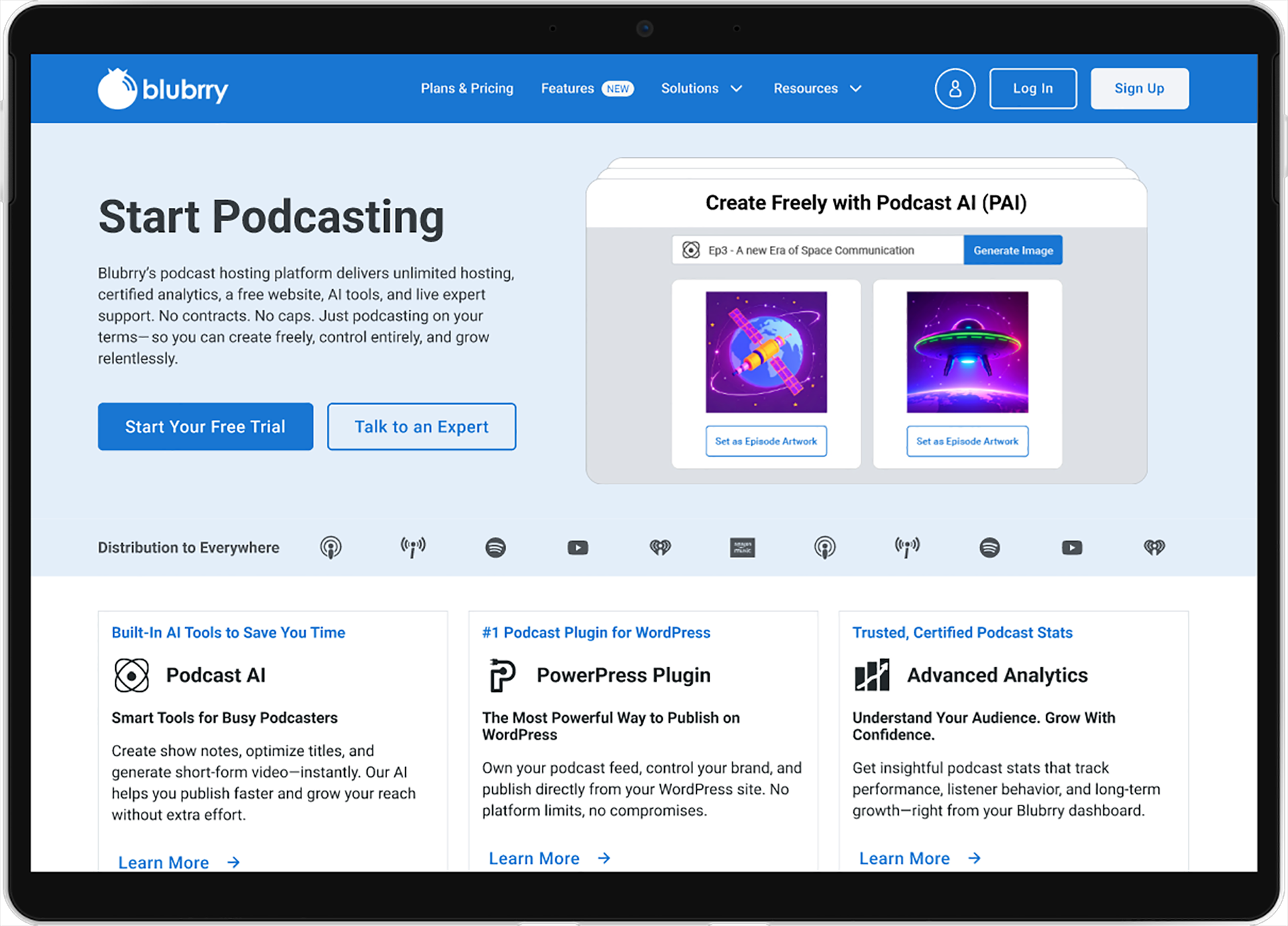
Blubrry Homepage
Homepage Redesign
Time to start podcasting
Blubrry podcasting is a software company with 20 years of experience hosting, analyzing, and growing podcasts. Podcasting has only grown in popularity and is now a main source of streaming content. This was the perfect opportunity to update Blurry’s branding and website to enter this Golden Age of podcasting.
Role
Web Designer
Skills
UI/UX, Branding
Tools
Figma, Adobe Illustrator
The Problem
Company’s should update their website every 2 years using in-depth user data, interviews, and competitive analysis.
The Solution
Redesign the Blubrry website to look more modern and create an better experience for users and celebrate the company’s branding.
User Research
Insights
Navigation Overload
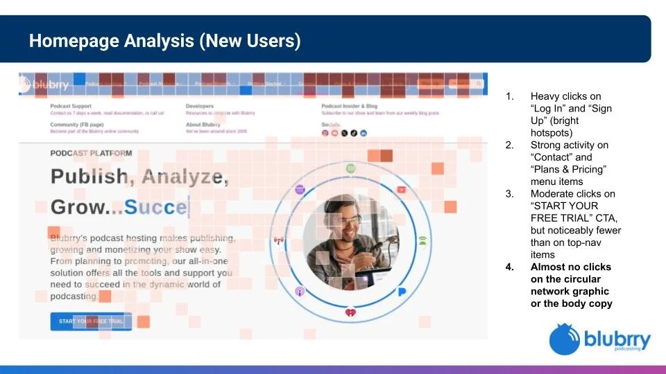
The Navigation bar at the top has 10 links and several sublinks. This is a heavy cognitive load for users to find their desired information and competes with the main goal of the page: starting a free trial.
Above & Below the Fold
All of Blubrry’s action happens above the fold. However, it’s so top heavy that the rest of the page has very little interaction. How might we entice users to explore below the fold?
The Era of Motion
Webpages are no longer static. Motion elements like videos, SVG animations, and micro animations have brought a new personality trait for brands.
Low-fidelity Prototype
I began wireframing different layouts to experiment with different elements at different scales. The goal was to simplify the navigation and bring focus back to the product and messaging. I also tried different strategies to motivate scrolling through the rest of the page.
Usability Study
I tested and shared my wireframes with the Blubrry team. At my demonstration for the homepage I received feedback on my progress:
Navigation
Blubrry was inspired to reorganize their top navigation.
Below the Fold
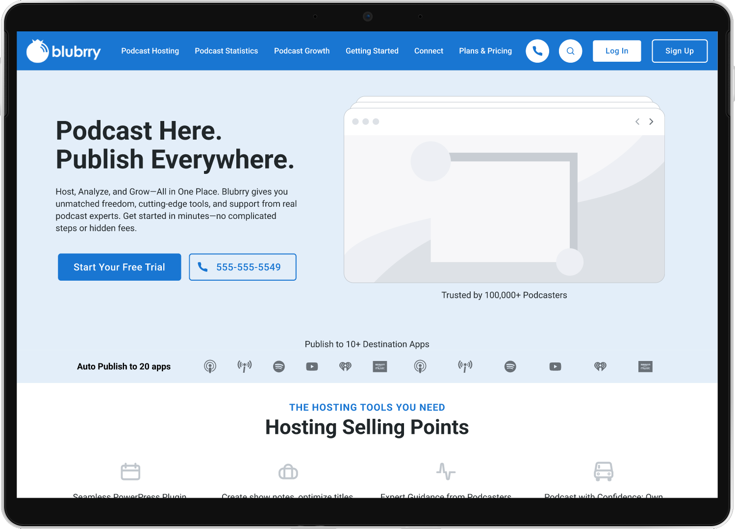
The team liked the row of destination logo that leads the eye down to the next section of content. Its provides valuable information without competing with their main message.
High-fidelity Prototype
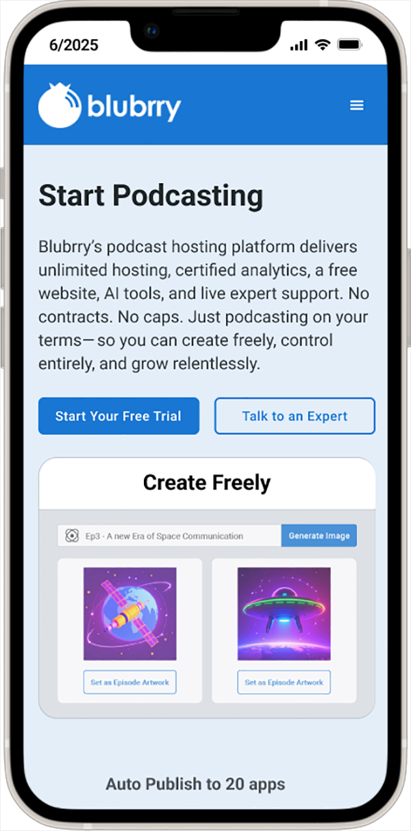
Moving from paper to digital wireframes made it easy to understand how the redesign could enhance Blubrry’s favorite qualities.
Evaluation
Accessibility
An accessible website with an easy-to-navigate homepage has become an asset for any company.
Discoverability
A stronger homepage message made Blubrry easier to understand and discover with AI and SEO algorithms.
Enjoyment
Having a more interactive first impression was popular with new and returning users of Blubrry’s products.


