P&G Signal Challenge
Brand Identity
Let’s boost the signal
This project was a three-month challenge for Proctor & Gamble’s Tide Studio to enhance the user experience of our DTC site. Using consumer feedback, user workflows, and creative exploration helped us restructure the consumer’s journey from the first ad to checkout.
Role
Graphic Designer
Skills
Branding, UI/UX
Tools
Adobe Photoshop & Illustrator
The Problem
While Tide is a household staple, they wanted to explore new DTC solutions for more specialized garments. Tide Studio gives P&G an opportunity to connect with users who love their clothes.
The Solution
Explore solutions for intergrading this new brand to the consumer from the moment they click on our advertisement.
Exploration
Through user feedback, data analytics, and a thorough audit of Studio’s site we were able to discover insight into our user’s purchasing experience:
A large amount of our site engagement comes from social media, but our advertisements were outdated. Returning visitors were less likely to click on them again.
Users were experiencing roadblocks and were confused by our information hierarchy.
Our site audit and data analytics raised the same discovery of users getting confused and cart abandonment.
Hearing our consumers echo the same problems we found in our data helped us to explore solutions for the consumer journey from the moment they click on our advertisement.
Experimentation
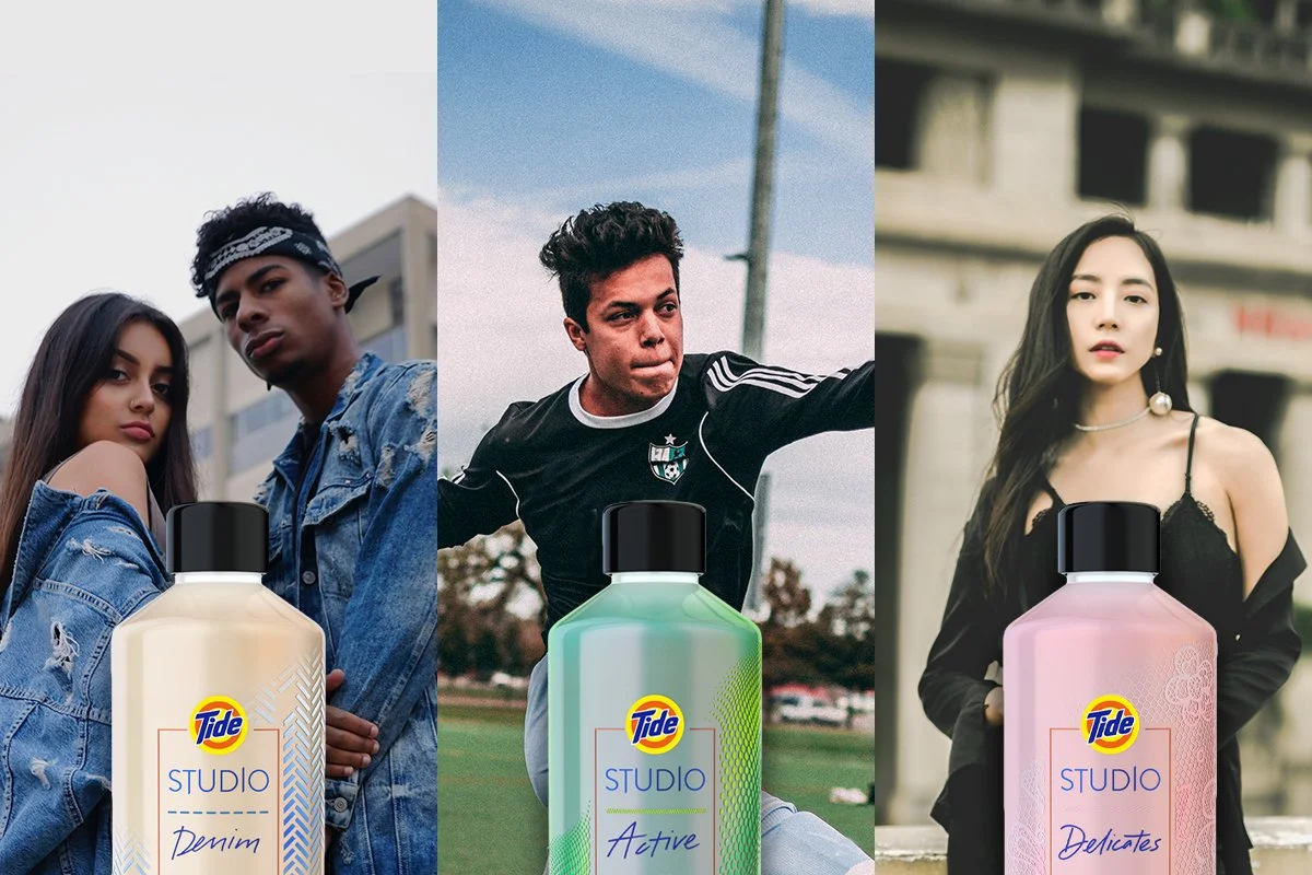
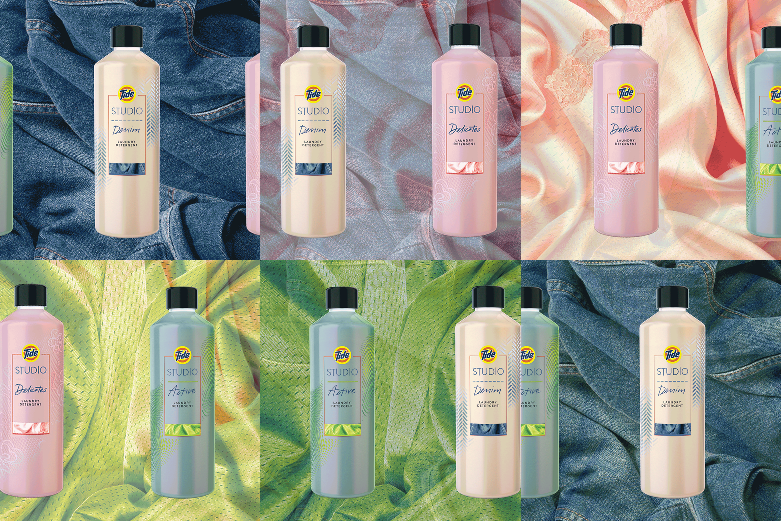
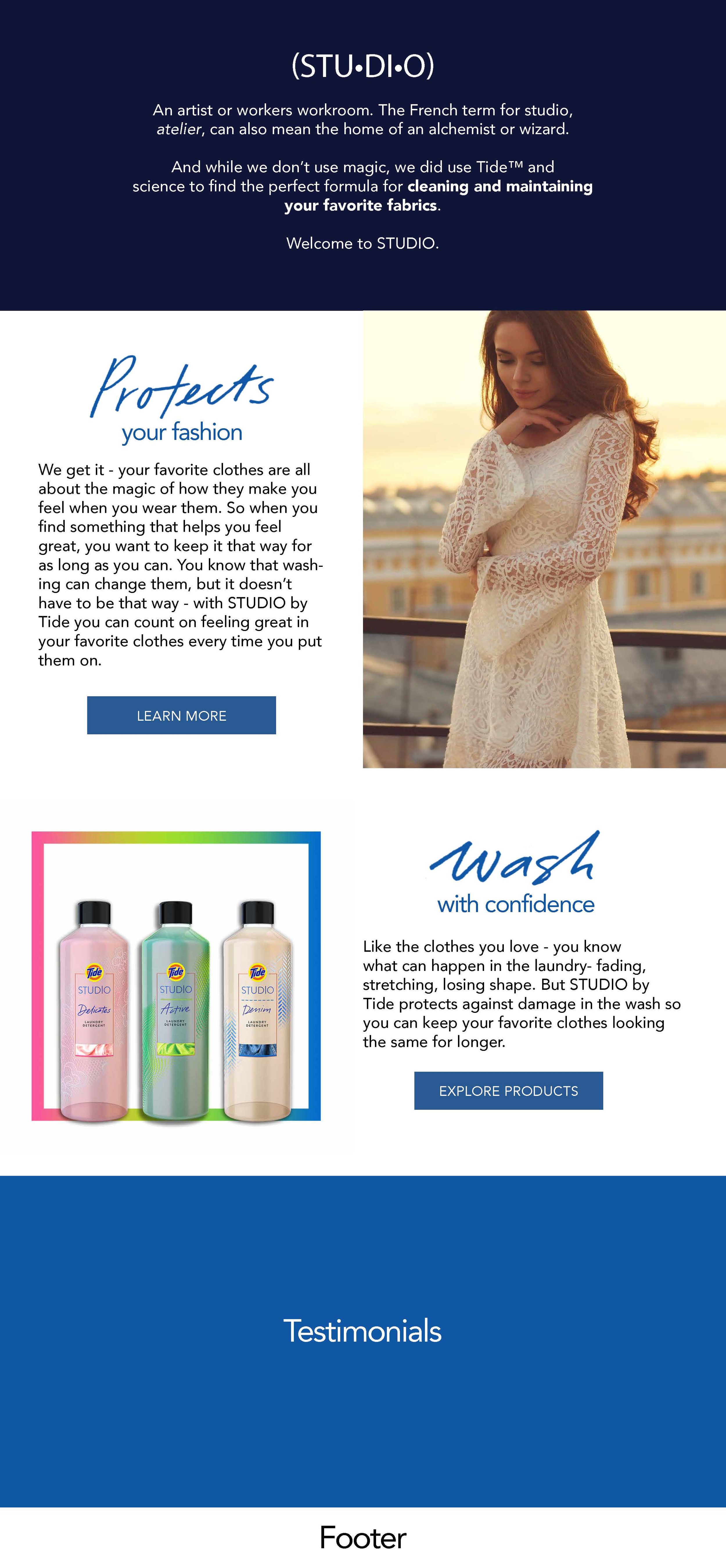
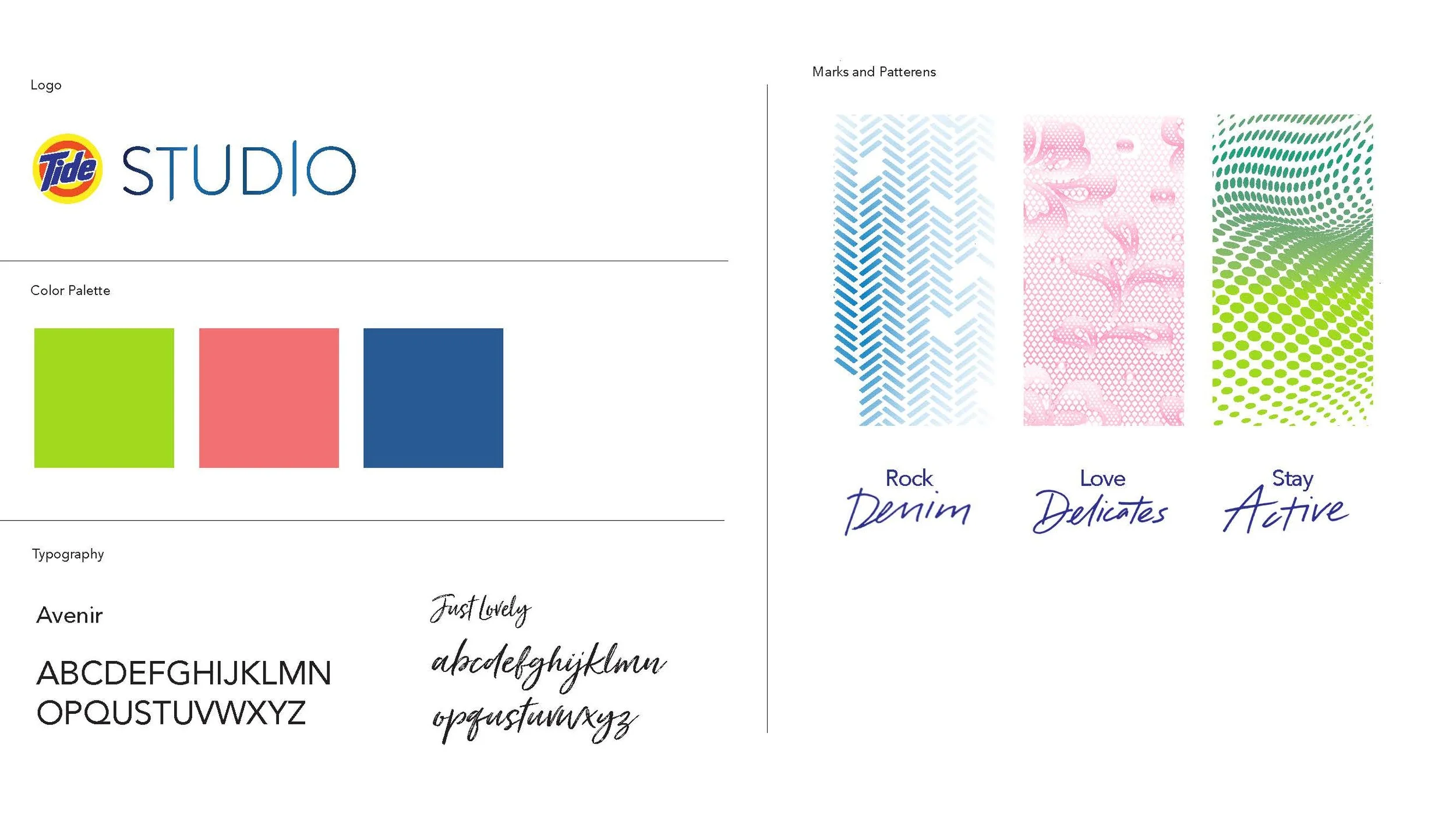
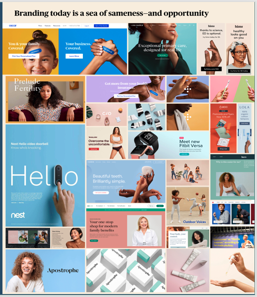
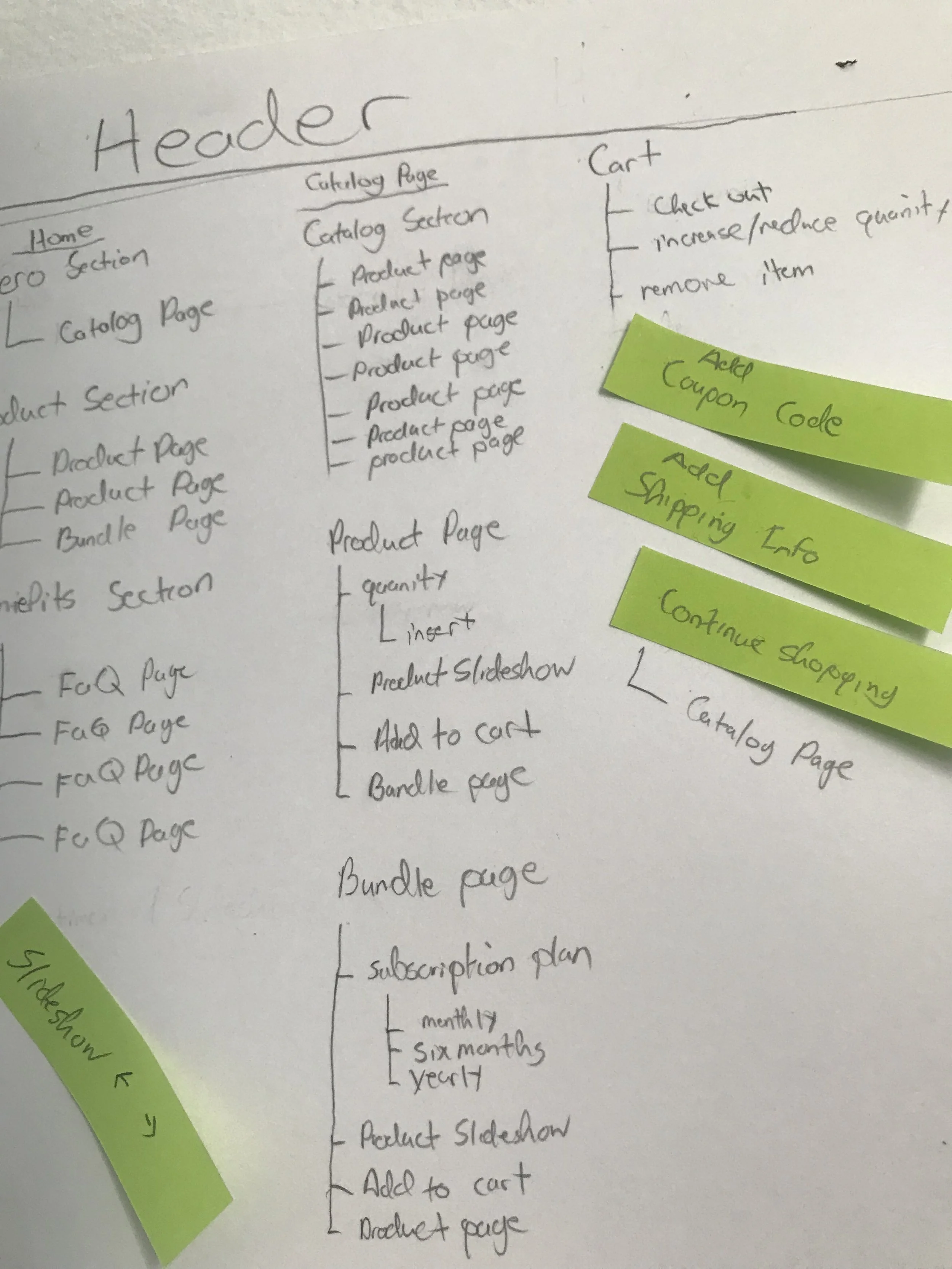
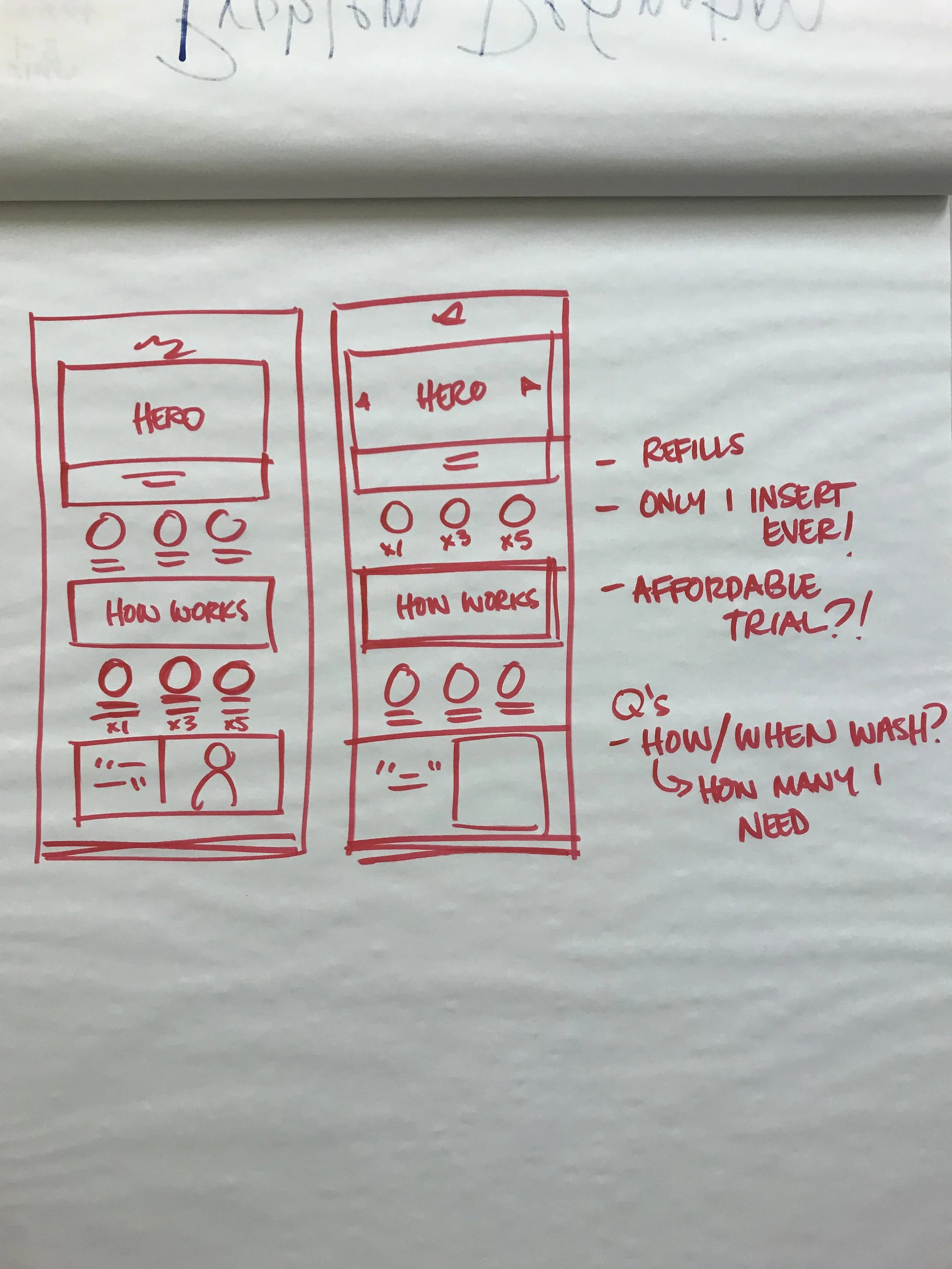
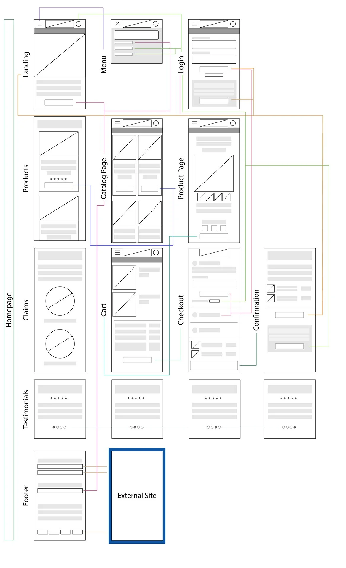
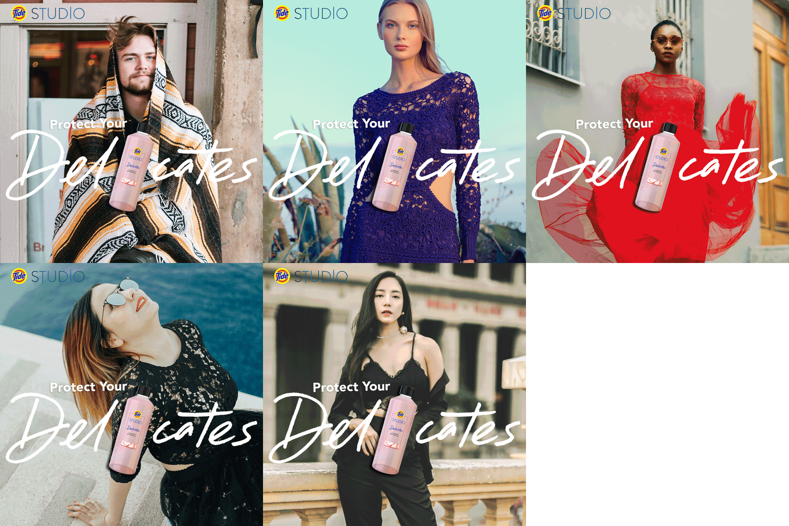
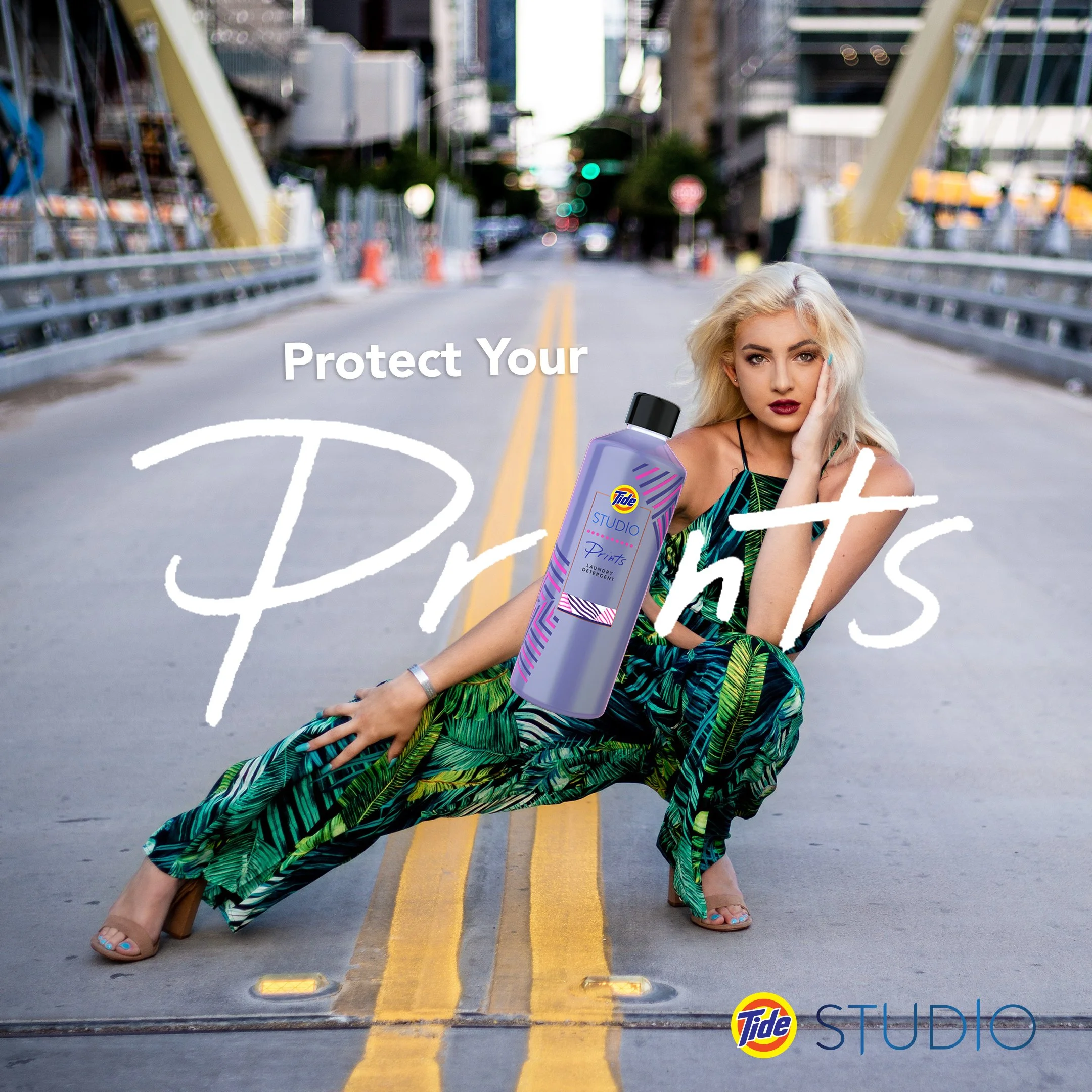
In our first sprint, we explored new visual styles to reengage our consumers with fashion-forward imagery. We deconstructed our site’s content and reorganized the information for easier way-finding. With our visuals and information updated, we began testing our solutions with target users.
UX Research and Wireframing for brand integration opportunities.
Execution
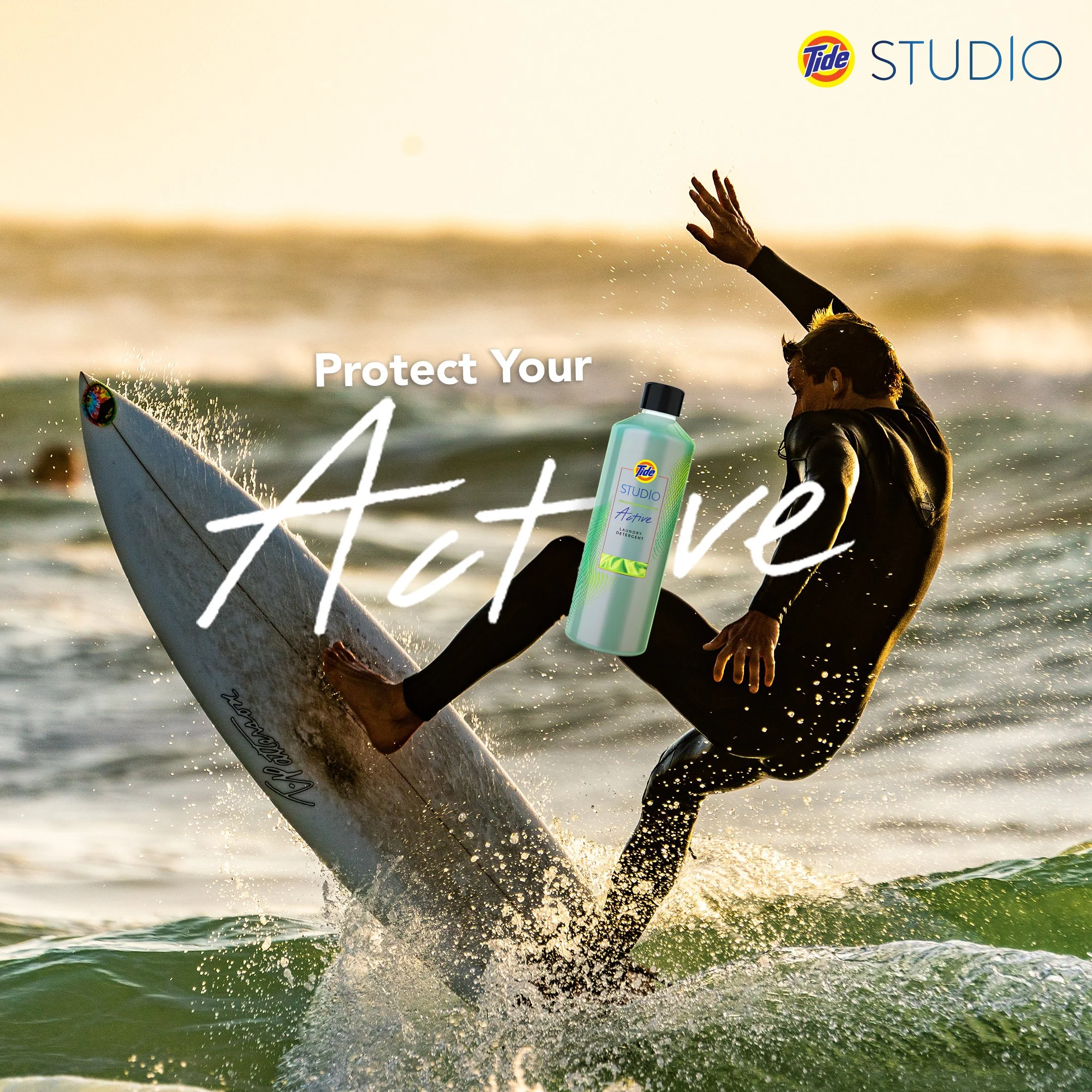
As we collected data and feedback from our users, our team focused on the journey through our newest feature: subscription-based bundle purchases. We designed a new batch of advertisements, promoting the benefits of the bottles. This increased traffic to our bundle page and tracked the user’s experience. It was the perfect testing ground for our UX insights and finalizing branding updates. With a large amount of data from our testing and consumer feedback we drastically increased the CTR and conversions. Our team was praised for their understanding of our DTC audience.
Evaluation
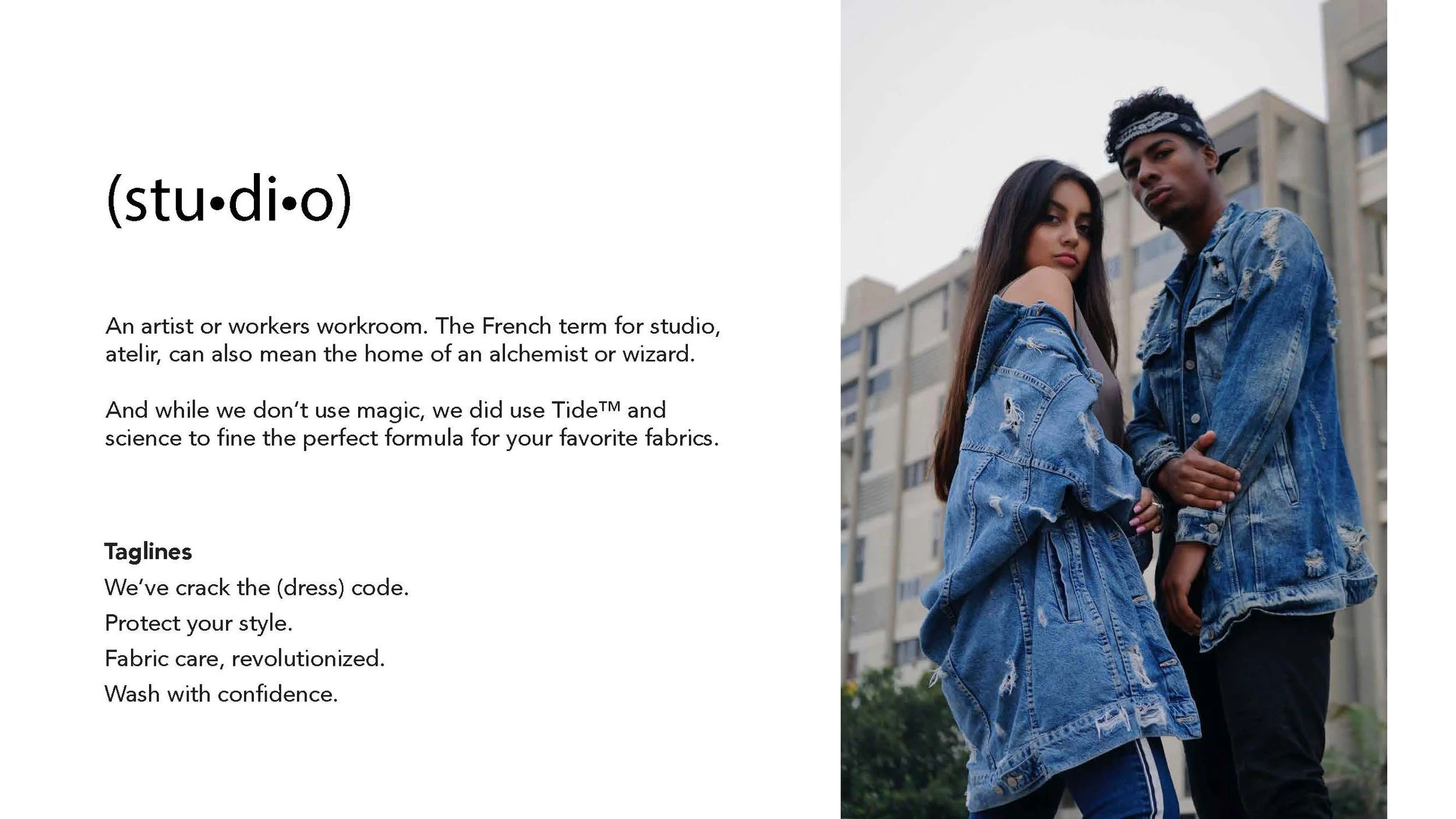
Branding should be seamless. Bringing the same design quality from our advertisements throughout our site helped enhance our engagements and boost our new users.
Our efforts we’re celebrated at the P&P Signal conference for our giving Tide Studio an exciting edge that still respected the overall Tide brand.


