Phoenix ART Museum
Website Redesign
Experience art effortlessly
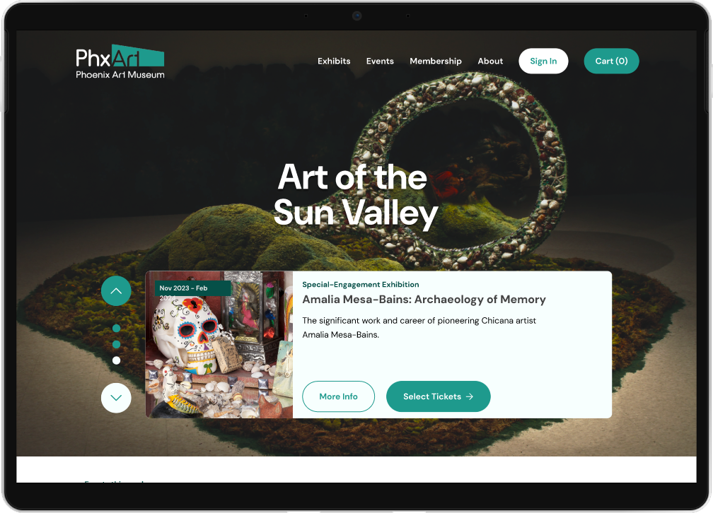
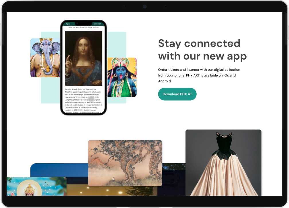
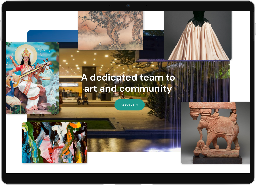
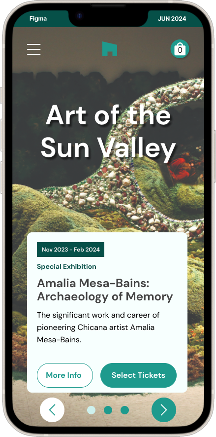
I designed a responsive website for an art museum as part of my Google UX Design Certification course. The Phoenix Art Museum attracts a diverse audience ranging from young adults to middle-aged individuals, including both local residents and tourists.
Role
UI/UX
Skills
UI/UX Design
Tools
Figma, Zoom
The Problem
Ordering museum tickets online is clunky, often using ticket plugins that doesn’t match the museum’s brand and confuses the user.
The Solution
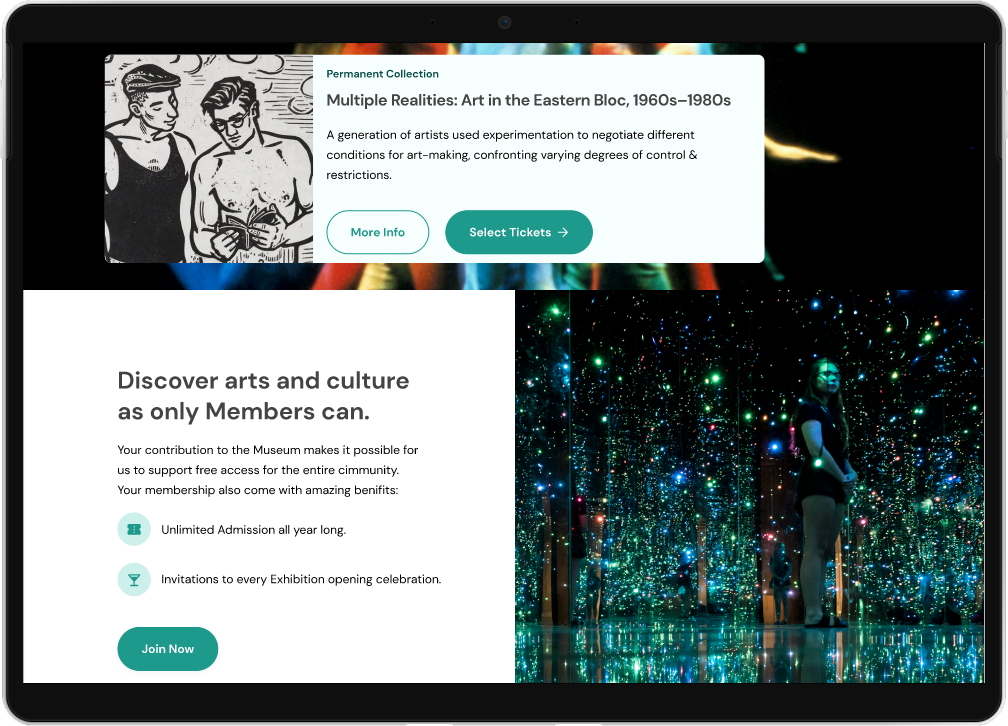
Design a website with an ordering process that integrate within the museums brand and easy-to-understand checkout.
Frustrations
Scheduling
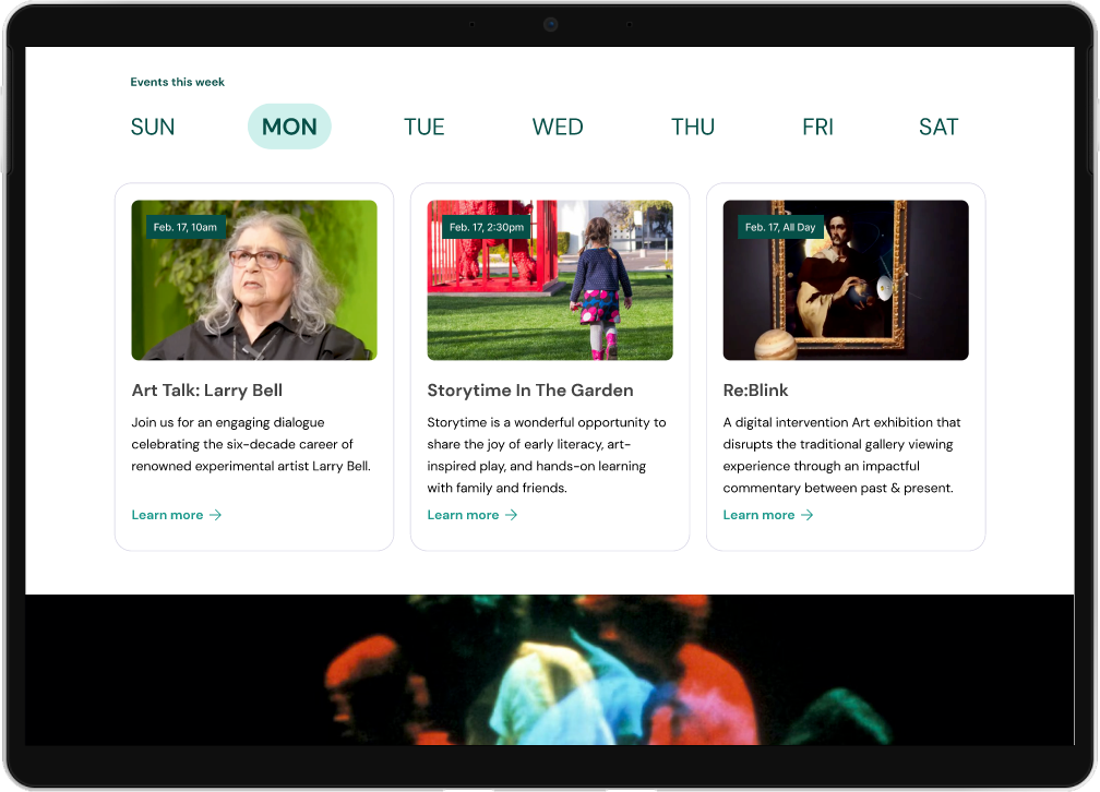
If users can find out about events and exhibitions at the art museum then they will be able to visit into their schedule while in town.
Cost
Different age groups have different pricing. This needs to be upfront instead of hidden before checkout.
Accessibility
Art is for Everyone. Clear visual hierarchy and landmarks is needed for easy scanning by assistive technologies.
How might we enhance Visitors ordering tickets to events and exhibitions at the art museum?
User Research
I created a user journey map to help identify pain points and improvement opportunities.
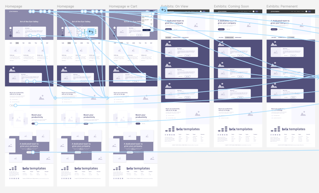
Information Architecture decisions that would integrate ordering into the exhibition/event pages.
Usability Study
I tested my wireframes in a moderated usability study with three participants who participated in my earlier interviews.
Tickets Dates
Users wanted to know when the exhibit was on display before learning more about it.
Checkout
Users didn’t like entering their card information before selecting their date of visit.
Membership
During checkout, users want to make sure their membership benefits were added.


